Everyday we are using keyboards to control our computers and it might worth to pause for a second and think about it:
- Why most of computers made with staggered layout?
- Why there are 100+ keys on keyboard?
- Why do we use a QWERTY layout?
- Is it worth to learn hotkeys to speed up work?
- Are there any better alternatives to mouse?
- How much time is worth to spend on optimising these things?
1. Staggered vs Ortholinear vs Columnar
A lot of keyboards come with staggered layout, but i dont see evidence on why it is a good choice.
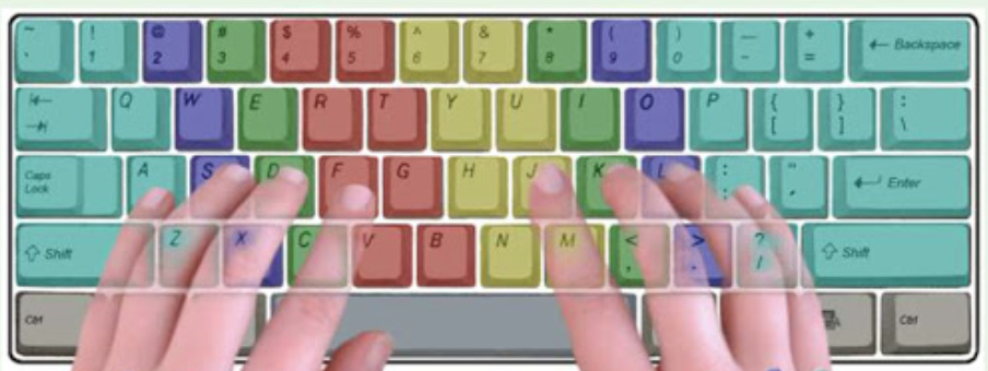
The main issue with it - an asymmetrical finger movements and different movement lengths. Just compare left index finger diagonal pathway from F to T versus right move from J to Y. Another example is pinky movement to upper row - left one goes to Q and right one goes to middle between P and {.
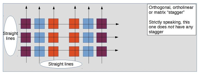
Ortholinear layout solves these issues, but it does not account for different finger length. Compare your pinky vs middle finger - pinky is substantially shorter. So its weird that pinky should have same button positions as middle one.
When columnar layout comes to play it solves both problems - we dont have weird finger movements and columns are shifted vertically to account for different finger length.
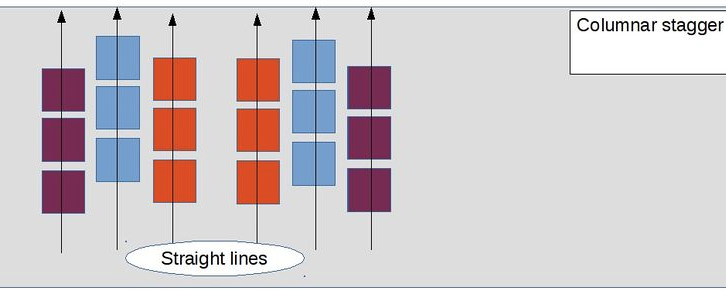
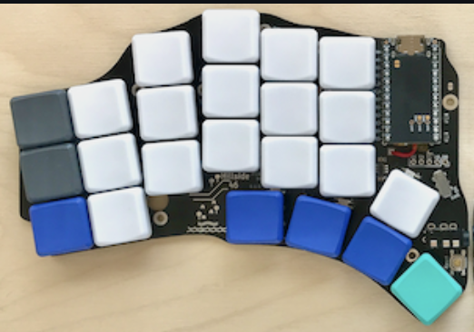
In my opinion, columnar seems to optimal one. But it can be improved - our fingers moves in different angles and each may need a different column angle. There are options to fix this, for example, hillside keyboard.
2. Why so many keys?
Touch typing is based on putting fingers on a home row - a default position from which finger move to another keys and after some time they come back to home row. For QWERTY its ASDF for left hand group and JKL; for right.
The main idea of most keyboards is to put as much as possible keys on it. But it comes with a major downsides.
Reaching digits require one of fingers to move 2 rows away from home row and disturbs position of other fingers at home row. F1 - F12 is a 3 rows away and worsens situation even more. Most of laptop keyboards combine Fn keys with volume / brightness / media controls which being used everyday.
Another issue is using numpad for numbers or using arrows navigation - both require right hand group totally move out from home row and its pretty hard to return back to home row with good accuracy without looking at keyboard.
Also we shouldn’t forget about hotkey shotcuts like Ctrl + Shift + Esc (win) or Cmd + Shift + 1 which totally disturbs home row positioning and puts fingers in a crazy non-ergonomic position.
Finally, moving 2 or more rows from home row is slower compared to home row / 1 row range.
Layers concept seems to solve these issues. We already using layers with traditional keyboards - Shift key switches buttons to capital ones and digits to some special characters. We can make all keys to be in range of not more than 1 row from home row by moving other keys to another layers which will be activated by pressing specific keys. You can imagine having 3-4 keys which act like a shift and each have specific layer - for digits, Fn keys, arrows etc.
There are keyboards with that concept. Ferris Sweep have all keys not more than 1 row away from home row. I'm using it on a daily basis.
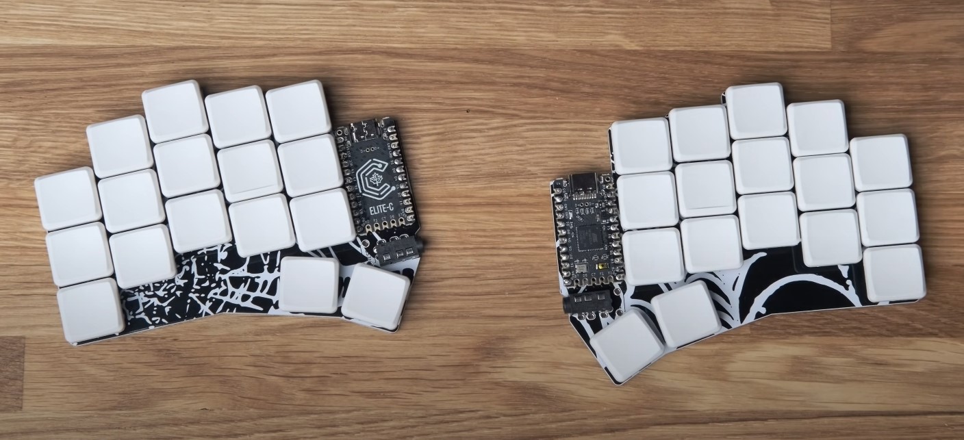
There are examples for layers, look at this one.
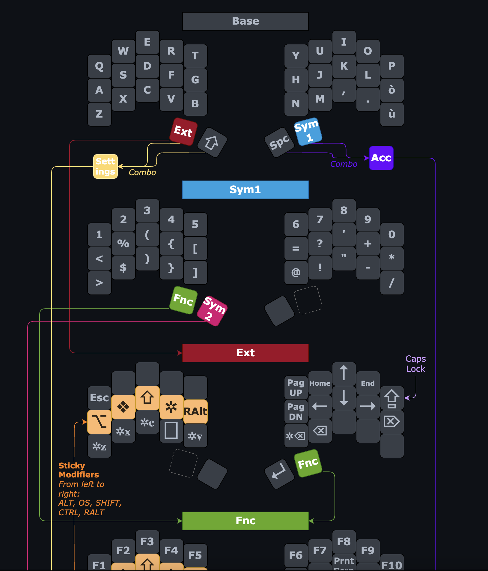
As you can see, there are 4 thumb keys mainly used for layer switching, space and shift. By pressing thumb key i can change ASDF keys for example to TAB / CTRL / ALT / CMD keys. So by pressing thumb key my home row for left hand transforms to most used functional keys. For me it seems as a pretty good trade off - press thumb key to get func keys at home row VS move fingers 2 rows from home row to use func keys. One more example of layers is Miryoku
Layer setting up can be done in pc / mac VIAL app or just in browser from vial.rocks
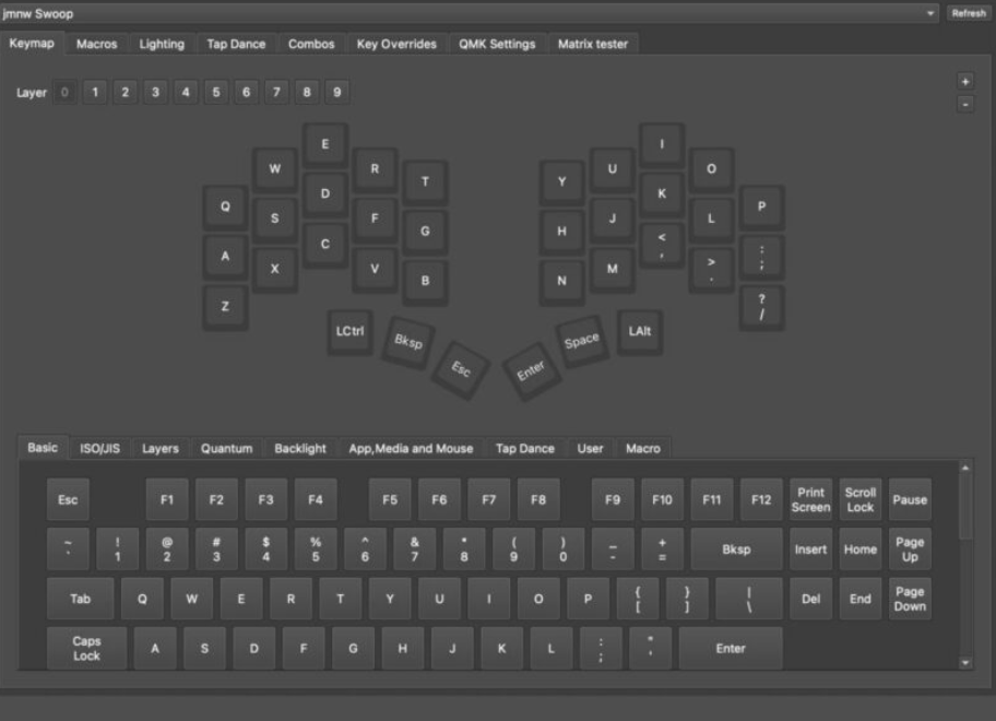
Interface is pretty simple and process is not too hard - just moving keys from bottom to keyboard, there already 10 layers available which should be enough. There are custom keys for activating layers on Quantum tab which can be put on keyboard keys. More info on this can be easily googled.
3. Why use QWERTY?
What principles the good keyboard should follow to be effective and ergonomic?
Different letters have different frequency. Good layout should account for that by putting most used letters at home row.
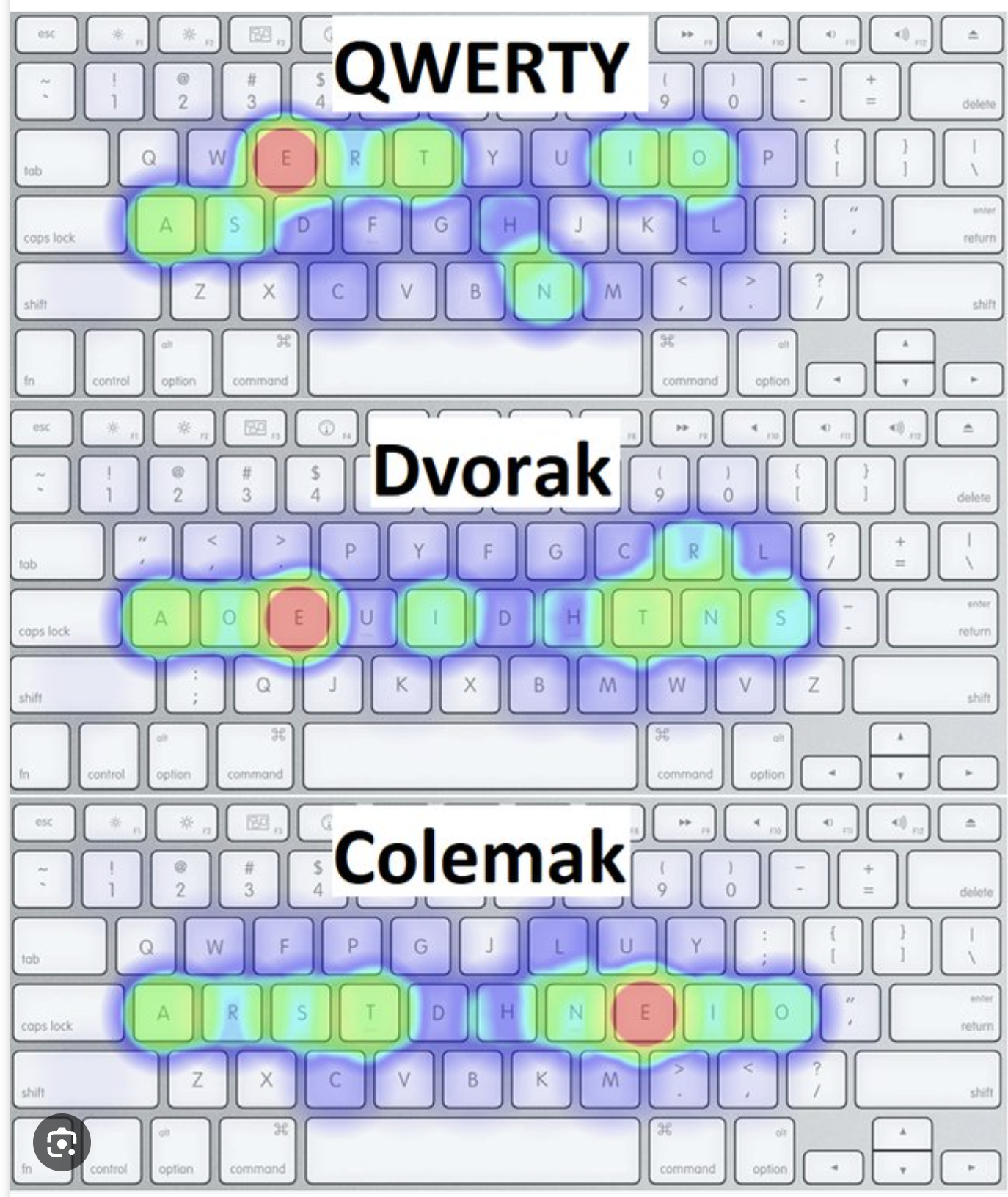
Here you can see that QWERTY doesnt follow that. I dont see a reason to put most frequent letters away from home row (there is a joke about QWERTY being made to slow you down).
What else we can see from frequency distribution? Left hand have more load compared to right hand, which is also looks weird. Right hand is more powerful and better controlled (applies to right hand persons) and it seems logical to put more frequency on right hand.
Often consonant letter comes after vowel and vice versa. In that case it seems to be worth to put most frequent consonant letters at one home row and most frequent vowel at another row. That will result in faster typing because when fingers from different hands type faster than from the same hand. As you can see QWERTY follows this principle pretty bad - ASDF and JKL; means only one vowel letter at home row. Colemak does better job on that - ARST and NEIO seems better balanced.
There a lot of other metrics to look when comparing keyboard layouts, i'm not going to describe all of them here, but same finger bigrams seems to be important one. Typing 2 letters by same finger slows down a bit and should be minimized for most frequent bigrams.
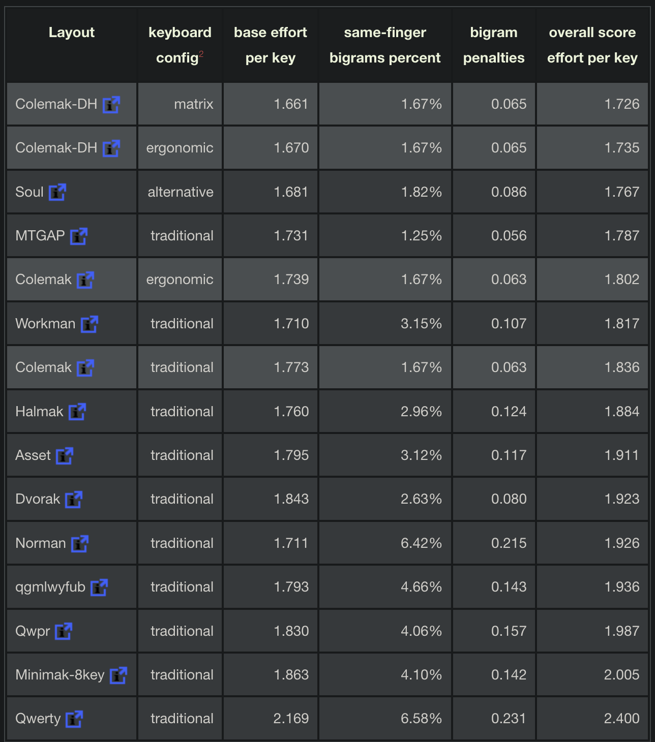
Here we can see that QWERTY loses to most alternative layouts. From my point of view QWERTY seems a bad choice if someone going to start learn touch typing today. But everywhere you will see QWERTY as default layout, which makes problematic switching to better layouts.
Argument that fast typing speeds can be reached at QWERTY doesnt disprove it bad design and ergonomic. Same applies to F1 cars, which can drive fast but uncomfortable and not optimized for general tasks.
For general person or a child who start learning touch typing now - it seems that Colemak / Colemak-DH is optimal choice. Colemak is supported by Mac / Win by default. My choice is ISRT, i've fully transition from QWERTY (40wpm) to ISRT (65wpm) by 20h of training (around 4 weeks, 20-30 mins per day of training)